Responsive Design Workflow
Who
Elysse, Julie
A responsive design for a website allows for it to interact positively in any platform and device that contains the same information and content that has just been adjusted within the technological environment. For a person interested and wanting to create a good responsive design in a website, it’s a good idea to establish a responsive web design workflow before crafting it. Many workflows related to responsive design will generally have concepts very similar to each other. The workflow will often have some steps that include but are not limited brainstorming, research, content creation, building and testing, launching etc., allowing the web creator to develop and evaluate each step defining how a website could be established and achieved.
Discover and Brainstorm
The first step in creating a responsive design website is discovering a concept. Once the important details and requirements are gathered, the project leader can brainstorm what their main goal is. Determining design concepts, themes, and layouts are significant during the planning phase to eliminate any uncertainties in the future. Figuring out how users will interact with the site should also be determined in this stage to ensure that content creation would be quicker and easier to develop and to establish an exceptional user experience.

Content Creation
The second step in the making of a website is creating all content and graphics needed for the project. This is where a user interface or graphic designer would create layouts and graphics using the information received while following guidelines and branding identity. Typical softwares used during content creation are Adobe Photoshop and Adobe Illustrator. Once the final designs are created it can be brought into Adobe Dreamweaver where prototyping is done. Multiple different softwares, proprietary and non-proprietary, are offered to create websites. Individuals who are not as familiar with the Adobe Creative Suite can use website maker websites to create responsive content as well.
Prototyping, Testing, and Editing
The third step after creating all the content and graphic components together, it’s finally time to bring it closer to action and build a website that showcases excellent responsive design for the web. It’s at a point where the web developer or website creator now has to think about how the website would respond and act on the web browser and on mobile devices with many different screen sizes. The creator would be in the process of building a website while testing the layout composition within different devices to see what works and what doesn’t work along with how it might appear to thousands of other users viewing it. With a website prototype, the creator is able to experiment with it making as many changes as necessary to their discretion. In this process, there’s bound to be many problems and issues that will arise in terms of the overall look and functionality of the website. A website gets tested many times where it gets fixed and adjusted in order to refine a website that has all the elements inside working together seamlessly. A good responsive design for the web or mobile should allow the user to easily interact and navigate through it.
Launch
The fourth and final step in the responsive design workflow is the launching of the website for the public eye. The web developer or website creator would have to host and run their website on a web domain. Depending on how they made their website, they can run it in an online web platform if it was mainly derived from code or the website can be hosted on a website builder that includes many useful design templates/layouts along with the ability to manipulate HTML or CSS code. When launching the website, it’s a good idea to check and make sure it’s running smoothly with a fluid and flexible responsive layout on all devices and browsers. 

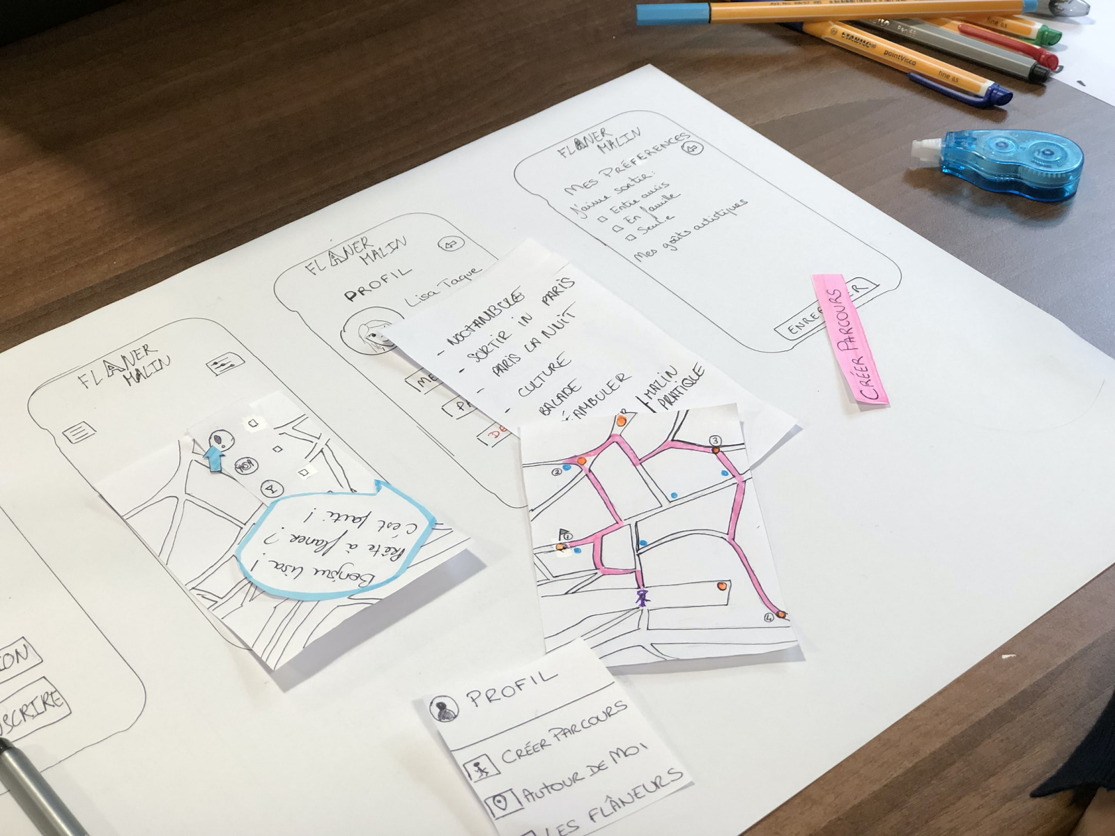
From start to finish, it takes a team to develop and create an amazing website with all the features needed to satisfy user’s experiences and beautiful design and layouts. The webflow of creating a website consists of four steps, discovering and brainstorming, content creation, prototyping, testing, and editing, and launching the final project. Following these steps will ensure that the finished project meets all the requirements for the job while establishing a successful website.

Know more about us
UserFlow illustrates and promotes elements of responsive design such as grids and layouts, text, and images.
Start Now