In today’s digital landscape, creating an online presence with a responsive design can tremendously affect your business. In our current society we intake information from a plethora of different devices that all look, feel, and work differently. Therefore, it’s even more imperative that businesses are able to market themselves successfully across all platforms and devices. Choosing to reject the idea of responsive design will do more harm than good to the marketability of your company. In 2020, the number of mobile users has surpassed desktop users and of that percentage 80% of users also identified that they will opt out of using websites that don’t work seamlessly off their mobile devices. Furthermore, 83% of the same mobile users agree that they would like the option to continue online experience through their desktop if need be. Seeing the importance of responsive design, search engines bury websites that struggle to or don’t use responsive design in their websites. Overall, ensuring that your company's online presence is fluid and frictionless across several devices and platforms is essential in marketing your business. Below we have listed a few companies that show how responsive design can affect the marketability of your company.
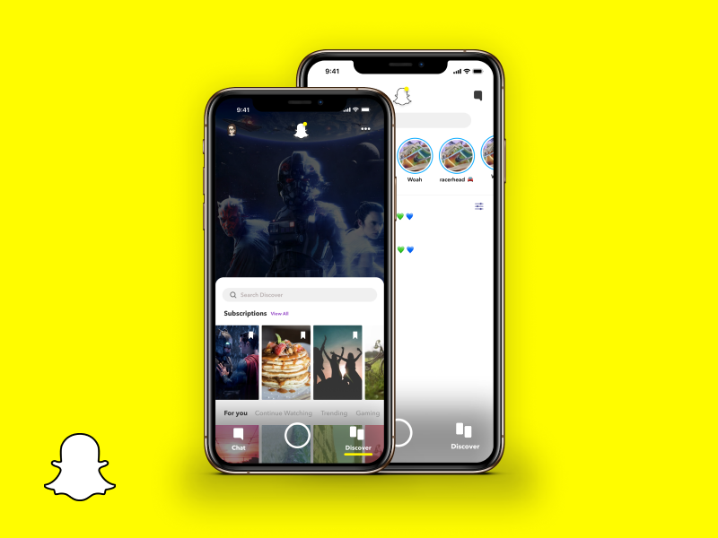
SnapChat
Whilst, showing off companies that used responsive design to their advantage, SnapChat is an example of a company that has suffered from it. SnapChat’s Android users have been complaining for years about how the app isn't correctly optimized for phones not running IOS. With the ever-growing amount of android phones coming out it becomes more difficult to optimize the app for all generations of android, so they chose not to. This made the android version of Snapchat significantly worse than the IOS counterpart in quality and use. Snapchat currently has more IOS users than android users to date, which is a bad idea for the 13th most popular social media platform to ultimately ignore their android users especially when android makes up 75% of the market share.
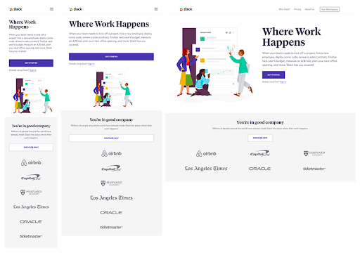
Slack
The Slack application is predominantly used by business teams to organize and communicate work together. The company uses responsive design to allow its users to seamlessly switch between devices comfortably and easily. Slack is a great app for conjoining mail, text messaging, and instant messaging, and is in fact used by the majority of companies around the world for its simple user interface and responsive design. According to a survey conducted by Mio Universal Channels, 31% of the businesses surveyed reported Slack to have the best user interface, with Microsoft Teams behind with 21%. With a snappy desktop experience and fluid mobile app, Slack efficiently stands out from its competitors.
Spotify
Spotify is a well known digital music streaming service, that is used in many daily lives. This streaming service is one of the most successful in responsive design for marketing. With an estimated 286 million monthly active users at the beginning of 2020. Because they focus heavily on following social media trends, Spotify’s marketing structure is adjustable and always developing. Spotify does not keep the same marketing plan and implement them for years, instead, the company appeals more to users by constantly innovating their ideas and plans to reach all consumers. According to SmartInsights, Spotify operates a freemium model with the majority of its users streaming music to their mobiles or desktop via apps or web browsers. Users subscribe for free, get ads between tracks which are part of the Spotify revenue model. Users of the free service encounter audio ads every five or six songs, or approximately three minutes of advertising for every hour of listening. You are even able to share and listen to music with friends at the same time, this is a great innovative market strategy spotify used, knowing that virtual commerce is taking over. Spotify overall is a really great example of a responsive design for marketing, and receives millions of net income with their techniques.
Know more about us
UserFlow illustrates and promotes elements of responsive design such as grids and layouts, text, and images.
.png)
.png)
