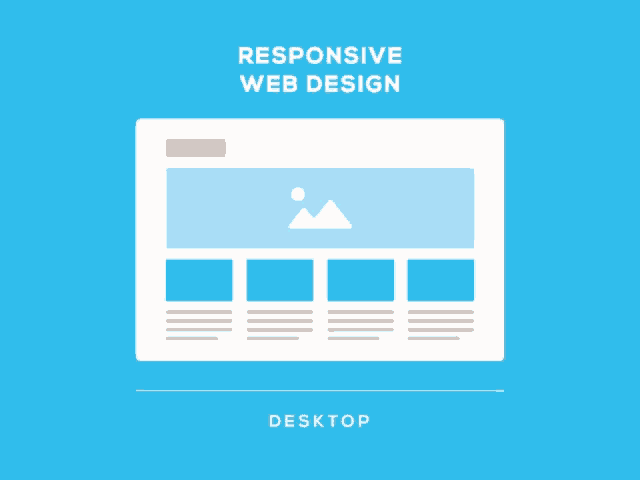
In this approach, the whole layout changes according to the capability of the device. Moreover, designers need to take the features of the devices into account. For example, the majority of the users will visit the web on a touchscreen. Today, responsive design is a critical factor in the web and it is considered a standard practice in the industry. Creating a uniform yet tailored experience is what every responsive designer should aim for. In practice, there are three core technical principles:
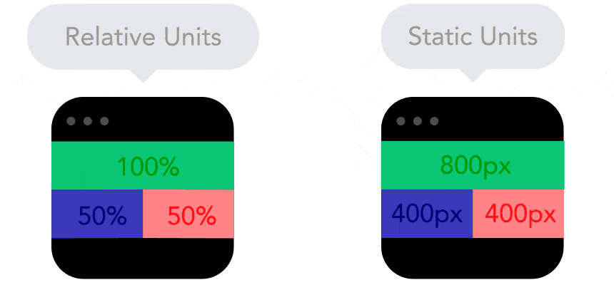
- Fluid Grid: elements used in the design would occupy the same - percentage of the space based on the device.
- Fluid Image: images are made of pixels and unlike vectors and text they are not fluid and flexible. Therefore, applying the best resolution is key.
- Media Queries: Media queries are filters in which detect the dimensions of the device and adjust the design accordingly.
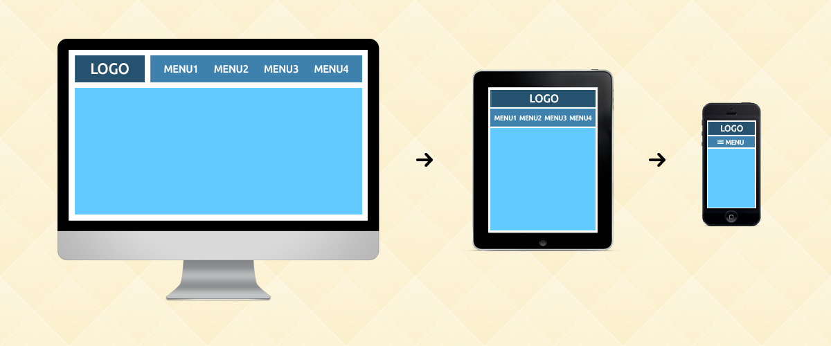
Navigation: It can be said that the success of website design is heavily dependent on the navigational elements of a website. This is because it is dependent on the user’s experience of configuring how the website operates. Optimally, the user would like to easily navigate the site with minimal to no difficulty.
Columns and Alleys: In its the most basic form, a grid is made up of two main components: columns and alleys. Columns are the building blocks of grids. The space between columns is referred to as alleys. Together, columns and alleys take up the horizontal width of the screen. This allows for flow and order of information presented to the user through headings, images, and text in the appropriate proportions while maintaining the structural integrity of the overall design.
Whitespace and Padding: Whitespace allows the design to ensure the items on the page are not too crowded or misaligned. This creates a higher attention span with your readers as it provides comfortability to their eyes. Visual Hierarchy systematizes and positions elements to display their order of significance to create structure for consumers to easily understand data.
When managing a visual brand in a responsive environment, it is important to find a good blend between usability and aesthetics. While strong visuals combined with less text may seem like an attractive choice, it is often less appealing when the site itself is not user friendly or adaptable to support this layout. At the end of the day, people must be able to navigate the website seamlessly. You should now be able to take away and understand what responsive design is and what it should look like through its technical and design perspective.
